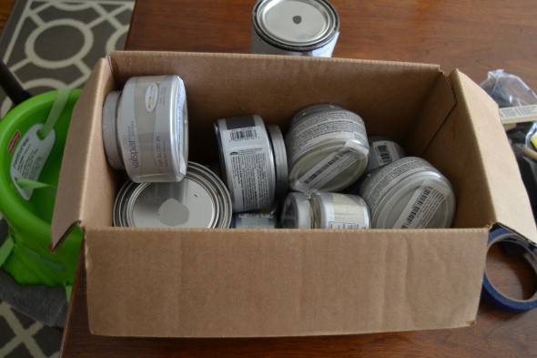
The Guest Bedroom

Our guest room has had a pitiful story since we moved into our 1900 house. We’ve moved in and out of it 4 times since we bought this house, and we’ll probably move back up there again when we start moving the Boy to his own bedroom.

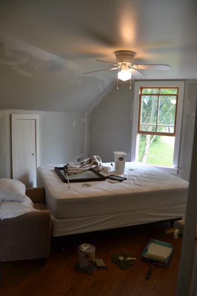
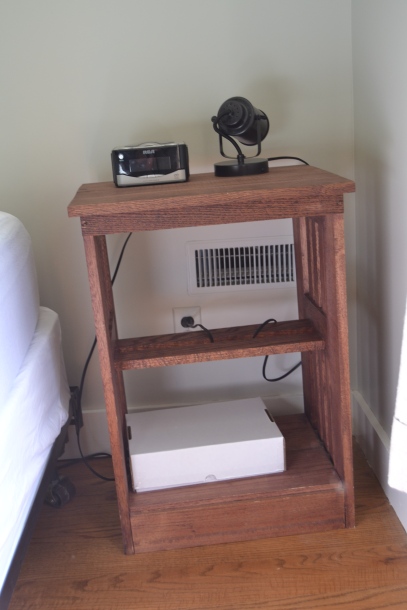
It’s basically been a halfway house (halfway bedroom?). Until recently, it was the holder of a bed with no headboard or footboard, a chair that originally sat in the Boy’s room but got moved when we put a tent in there, and a nightstand that was one of Peter’s first pieces of furniture. It was the recipient of a massive purple stain of gentian violet (my fault), and until a couple weeks ago, it housed a whole lot of blah in terms of neutral colors, leftover bedding and curtains, and a previous owner paint job.

DSC_0021

My parents stay here when they come visit, and my dad (politely) notes that his pillow falls off the back of the bed all night because there is no headboard. We’re going to move back up there soon, and I have the same pet peeve, so I’ve been thinking about a solution to wandering pillows.

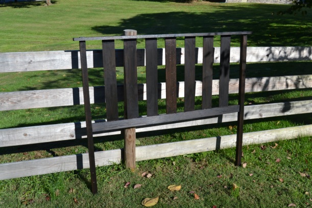
Enter this headboard. Another of Peter’s earliest furniture projects, it was his headboard all through grad school. We borrowed an antique iron bed from his parents so we could have a queen mattress, and the old headboard got moved to our basement, where it gathered some dust and mildew.

DSC_0079

I started rescuing it the same weekend I scrubbed the new back door. See? there it is, about to be scrubbed!

DSC_1271
Pretty green sweet potato vines…they were liquefied in the frost of last weekend. Solid to liquid state in the blink of an eye.

The stain on it had faded in some spots. Pete didn’t really care if it was painted or stained (okay, I did get, “But it’s an oak headboard,” one time). While I was washing it, I started thinking that my typical “paint it white” attitude might not be appropriate for this room.

I told Pete, ” I have this crazy idea to paint the bed a crazy color.”

“What color?”

“The orange that’s on the doors to the house.”

He said, “Don’t paint the bed orange.”

I said, “Well, I’m gonna think about it.”

So, this weekend, I painted the bed orange.  (Ah, there’s a twist in the plot! I started writing this post before I had actually done the orange-ifying. And then I didn’t orange (new verb for the WIN).)

The more I thought about it, the more I realized how much in my house is painted. I’ve been accused of being “anti-wood” (by fascists), which isn’t fair because I have yet to take something that wasn’t already painted and then paint it. I’ve only re-painted things (my prerogative as Chief Color Complainer). But, those fascists do have a point: the house has a lot of painted items in it.

I considered this headboard for weeks while it sat taking up room in the shop (sorry, Pete), and I finally settled on staining it with an ebony stain that we had used on some frames in the living room.

In my early days of having my own space, I really shied away from black because I thought it was a cold alternative to brown and gray and that I could never get greens, blues, browns, or any other warmer color to coordinate with it without looking stark. I’m learning now, though, that there are warm blacks, and this ebony stain fits that description. It has the modernity of black, but because it’s a stain, there’s depth to it that you can’t achieve with paint. The oak is nicely highlighted, and because Pete’s design was Craftsman-inspired, the headboard doesn’t look super contemporary. It’s a good lesson in going for classic silhouettes; they adjust well to the times without looking cheap.

DSC_0084 DSC_0085

On a sunny day that I had off of work, I stained this thing. I left the polyurethane off so that someday, if I do decide to paint it (like, if it becomes the Boy’s headboard on his big boy bed), I won’t have to strip it.

I was in a hurry to get the headboard done before we had guests a couple weekends ago, but then it sat in the shop a bit longer (sorry again, Pete) because we lacked the necessary hardware. The extra time allowed me to tackle something that’s been on my list for years: repainting the guest room/halfway house.

DSC_0014
Icky Green. I’m sure that was the name on the paint chip.

DSC_0013

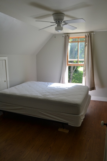
This room was an icky green that was hard to convey in photos, but trust me when I say that a coat of Bay Sands by Valspar really lightened it up. It’s the same color that I used in the dining room.
baysands

DSC_0016

See how much lighter it looks? And yes, there is a block of wood under the frame. It needs a new caster. This is why I don’t run a $1.000,000-a-year lifestyle blog.

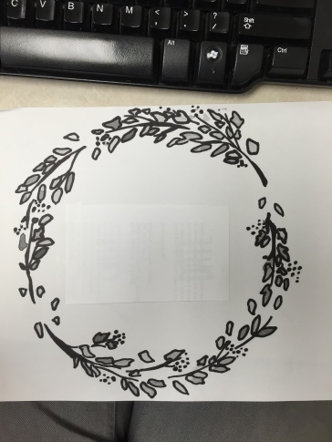
I had been searching for new bedding for this room for a while, but when I found some $10 shams with a neat floral design, I realized that they perfectly matched a coral quilt that I used in college. I have plans for a throw pillow for this room– I’m going to start that embroidery project really soon and will chronicle it on this blog (after I get past the PROJECT THAT RUINS ALL ATTEMPTS AT OTHER PROJECTS, to be discussed in a week or two). The basic design will look something like this, modified from something I found online:

embroidery

The mirror is one that Pete bought at a flea market before I met him for $10. I really like the color of the frame and I even kind of like the damage to the silvering on the mirror. If anything will keep a room from looking too modern, it’s an old mirror.

DSC_0018

I also have some plans to get an Audubon plate printed for artwork, so I’ll be talking about that in a couple of weeks, too. See? So much for which you need to stay tuned!

I’m going to re-stain the nightstand in here, too, as it was part of the Great Gentian Violet Incident of 2013, in which I poured purple crazy all over myself, my son, the bedding, the wall, the floor, and the nightstand. That stuff does NOT come out…

DSC_0019

…and was a large part of why I had to repaint the room, since it looked like a Smurf had been murdered up here.

Annnnd, because we have to complicate things, Pete and I decided last weekend, when we were sick as dogs and Boy was full of all the energy of a 2-year-old who finally feels better after a bad cold, to clean out the closets and get real Draconian on our stuff. This happened last Saturday.

DSC_0025
On with the headboard, out with the crap!

I’ll probably have this space close to finished in a couple weeks…which is good, because we’ll be moving up there again soon in order to start renovations on the master bedroom downstairs. I’ll try (operative word being try) to post some kind of “reveal” on here when the room is, for all intents and purposes, done, but it will include crappy photography because I know not what I do.

No rest for the wicked, eh?

My Version of Comfortable- What’s Yours?

I think I’ve said on here before that I’m obsessed with DIY/decor blogs. I really love seeing how people live in their homes and watching them solve the challenges of making a comfortable home given whatever constraints they’re working with (budget, pets, kids, time, location, old house, new house, decorating for a loved one who is disabled or in a wheelchair, whatever).

cropped-cropped-image.jpg

I was trolling through a gallery of pictures the other day of  the 2015 Southern Living Idea House in Virginia, decorated by a famous designer named Bunny Williams. Her style is nothing like my own, but I loved what she said about her design philosophy. “Your home should be the most comfortable place you can imagine.”

It got me thinking about what I think makes a home comfortable. And remember, this isn’t necessarily Pete’s opinion, and it certainly isn’t the Boy’s, because his version of cozy involves throwing all the couch cushions on top of me so I can live inside a tiny couch cushion tent (thanks for that, dear child), so that means we have to compromise on things because it’s not just my home. But if I have to come up with some words that mean comfortable to me, they would probably be simple, clean, and warm.

I think the simplicity part is probably the most important for making me feel like my space is comforting. Comfort, for me, comes when all the messes are cleaned up and I don’t have to worry about the fact that I see dog hair scooting unassisted across the floor like a tumbleweed or the gallery wall isn’t completely plumb (the No. 1 reason I will never install one). I suppose I subscribe to a certain amount of minimalism in my home because there are fewer things to have out of place and because, living in a house that’s kind of simple itself, ornate furniture and decorative items would feel out of place. If I imagine a cozy corner for myself, it’s a soft chaise that is easy to keep clean, a blanket made of natural fibers so it doesn’t pill and it breathes nicely, a table that’s big enough to have a pot of tea on it without me worrying about spilling it or knocking it over (apparently, my clumsiness dictates my decorating style), and a book.

Particular much? Yeesh.

Cleanliness is kind of linked to simplicity, but I was a college student who cleaned her room before starting homework because I cannot work in a cluttered space. When Pete asks me what I want when he’s making furniture for the house, I almost always ask him to make it the way that’s the easiest to clean. Is this to say my home is spotless? NO, but I like to streamline cleaning so that I can address an area in a reasonable amount of time.  Simple and clean are linked and equally important.

DSC_0986

Finally, warm. I don’t necessarily mean warm colors. I mean that in my cozy home, the hatches are battened, the cracks are filled in, the socks are thick, and the tea is the perfect temperature (not hot enough to burn my mouth, but hot enough to feel in my belly). So, maybe I mean solid instead of warm? This girl from the prairie loves the chilly wind, but she likes it to stay outside.

Simple. Clean. Warm. Solid.

When, prompted by Bunny Williams, I think of those words and apply them to my house, it helps me think of some changes that, someday, I’d like to make so that my house feels more like those words.

First, I’ve been trying lately to add a bit of color where it counts without ruining the simplicity of the space. I think my instincts when it comes to furniture and paint colors gravitate toward neutral, and sometimes that comes off as cold. It was a big step for me to choose a colorful, patterned curtain for the back part of the house.

DSC_0008 DSC_0006

I’m starting to think that I need to be willing to experiment with these things in the dining room; it’s been without a curtain for months now, partly because I can’t decide on a color or pattern and then I chicken out. And also because I need to budget my fun money for something.

DSC_1224

Particularly as winter approaches, and I won’t be able to rely on flowers to warm up the space, I’ll need to think of ways to cozy the room up.

DSC_1213

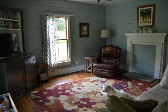
The living room has plank walls which warm it up, and a new rug is on the docket for multiple reasons (re: dogs). Someday, and believe me this is a someday because we won’t be putting it on any credit cards (we’re not going into debt over it), I’d like to get a new couch. The more Pete and I talk about it, the more we’re thinking we’ll save a little longer and eventually get leather. It has the color and warmth we want, and it’ll be easier to clean, and I kind of like the look leather gets even as it gets worn in a bit. If we do that, I think we’ll try to buy a piece that will last us as close to forever as possible. So, we’ll see, and in the meantime, we’ll keep using our $80 Craigslist find of a couch, even though one cushion is literally falling apart. At least I don’t have to care if pizza night ends up “rub pizza all over the couch” night.

Finally, the master bedroom. I’ll be posting pictures of that one pretty soon because that room is getting a serious overhaul this winter. We’ve got some big plans for it that, we hope, will increase its functionality as an actual bedroom, which it wasn’t meant to be, and will look architecturally appropriate to the home. We’ve never decorated a master bedroom because, and I think this is the case with lots of people, it’s not a public room and those get attention first. Exciting new challenge!

So, if you read this whole thing full of all the words and few pictures (thanks for that), I challenge you. If you’re into this stuff, sit still for a second and think about your house or apartment. Think of what “comfortable” or “comforting” (maybe I like that one best) means for you when applied to your home. I get bogged down all the time in the details of what my house should look like, but the point of this whole blog is to help me figure out what our house should make us (specifically us) feel and to share that journey with you. What’s your comfort at home? Leave a comment on here or on Facebook with your words because I’d love to hear them!

Protecting the Neighbors (or, My Custom Order Curtain)

The best thing about having a new back door has been the light streaming into a once dark, sad space.

The worst thing has been the assault on the neighbors’ eyeballs every time we get up to go to the bathroom in the middle of the night and have to wander past the back door in our pajamas. Contrary to the beliefs of college students across the nation, pajamas are not for public consumption.

Pete’s been asking me what I was going to do about the curtain back there for a couple weeks, and I told him I had something up my sleeve. Well, this weekend, I finally got my new curtain!

DSC_0003

I ordered it from a seller on Etsy. Probably most people know what that is, but for those who don’t, Etsy is an online community of makers and artists who sell their work via the online marketplace. You can buy everything from furniture to jewelry to clothing to tech to special design services for your blog or website.

A long time ago, I “favorited” a shop on Etsy called Giardino. Pam Garmhausen, who runs the shop, makes hand block printed textiles and art prints. I have always loved her designs and her colors, and since I’m frequently accused of wanting to paint everything in the house grey, I decided to take a chance and order something that had color and pattern.

I know. Big step.

I was super drawn to one of her block printed patterns in a yellow shade, and emailed her to ask if she’d be willing to make a curtain for me in that pattern and color.

giardino1

Pam emailed me back within an hour and said she’d love to work with me on a custom design. Over the course of a few emails, I gave her measurements, requested that she add both a rod pocket and back tabs in case I needed to use the curtain elsewhere someday and needed all the hanging options that were available, and then asked her to wait a day so I could triple-check my measurements (once a type A personality, always a type A personality).

Pam set up my special order, I purchased it through Etsy, and after a couple of weeks, my curtain arrived! It was freshly laundered, packaged in brown paper, tied with a cute little twine bow, and accompanied by a hand-written note from Pam in a card with one of her other prints (and she even wrote her note on an extra piece of paper so I can use the card).

DSC_0005

loved this buying experience. I knew the whole time that I’d be getting something that was one-of-a-kind, due to the nature of block printing and because I was setting up a custom order. I got a chance to chat with the maker, and ultimately, I knew I was helping her continue doing what she loves and making a living at it. There was no going to 3-4 different stores, not seeing the options I wanted, no settling for something that wasn’t quite right. I got a piece of someone’s artwork.

DSC_0006

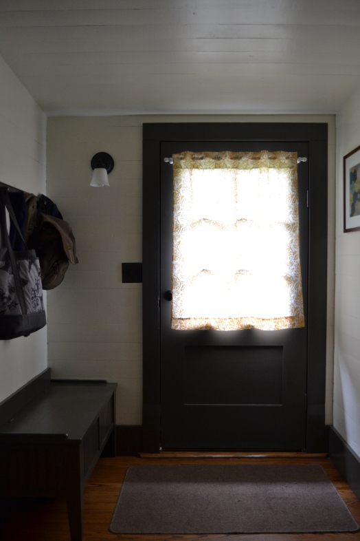
I love the way the new curtain looks and the way it lets in light without being so sheer as to be problematic. I think sometimes, my decorating can seem a little cold, so it’s nice to have a bright color and a fun pattern to make the mudroom seem more like someone with opinions actually lives in the house. I switched out the artwork in the mudroom (not pictured) because the yellows were clashing, so now, one of our Yoshiko Yamamoto prints resides back there. I love the saying at the bottom of the print; it seems like a good reminder every time we leave the house or come home.

yoshiko1
I forgot to take a picture of it once I had switched it out on the wall, but this is from Yoshiko’s website.

Yoshiko Yamamoto does block prints that are directly inspired by the Craftsman era, and a few years ago, she published a series called The Wisdom of Trees. Pete let me pick one as a birthday gift, and by Christmas, we’d decided to spend money we didn’t have to get the whole series. Pete built the frames, as having the prints framed by Yoshiko was going to cost much more.

There are a few other purchases throughout our home that I’ve made on Etsy or Etsy-like sites. One is the set of candle holders that sit on our mantle.

DSC_1211

I actually fell in love with them on Etsy, but found them a few months later on a site called ScoutMob (similar to Etsy, but a smaller and more “curated” collection– stuff tends to conform to a more modern, maybe more hipster look) for half the price. The shop is called Convivial Production and the artist makes really neat, architectural pottery. The WPA reproduction print above them is also an Etsy purchase; it was a birthday present for Pete.

The point of all of this is that it’s easier now than ever to find interesting things with which to furnish your home. It doesn’t have to cost an arm and a leg, and the things you buy help someone make their passion their livelihood. And, bonus, you end up with a one-of-a-kind home that feels comfortable to you because it reflects the things you really love and the values you hold dear.

DSC_0008

Someday, I’d love to learn to do what Pam does and make things like this myself; in the meantime, though, I love that I could buy her work. It makes me smile every time I walk through the door!

Reusing a Salvaged Door (Part II) and Why I Love Architectural Salvage

When we last saw our new back door, which we bought at an architectural salvage warehouse (hey, Champaign-Urbana friends, did you know there’s a great one in CU? I’ve been there and it’s pretty righteous), doctored up, and installed in the back of our 1900 house, it looked like this:

DSC_1292
Deep dark hole no more! Sad, dirty old door that lets in light but makes it look like the back of a run-down antique shop! Hooray!

As the household’s resident Picker of Paint Colors and Complainer When They Aren’t Exactly Right and therefore Supreme Leader of Repainting Crap Again, it was my turn to jump into the project. Which I did, when I got a moment during which the Boy wouldn’t overturn the paint can on his own head. Believe me, those moments are few and far between.

The trim in the back of the house has been a bit of a saga. When we moved in, it was an icky avocado green that I didn’t really love and which I grew to despise over the course of 2.5 years. This spring, I finally worked up the energy to repaint it all. And I did. With like, 4 different grays. Because I couldn’t find the right color.

DSC_0072
Admittedly, almost all grey.

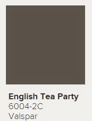
Finally, I allowed He Whose Input is Greatly Appreciated and Respected Despite My Initial Defensive Response to It to tell me that the grays I had chosen didn’t work, and I chose a color called English Tea Party from Valspar. It’s a really nice charcoal gray with brown AND blue undertones. It has subsequently made it into the living room and our dining room in different spots. It’s THAT nice of a color.

englishteaparty

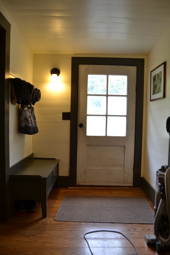
All this to say, the door needed to join the English Tea Party. And I had to repaint all the trim…because I had chosen eggshell instead of semi-gloss the first time and dogs/dirt/vacuum/toddler. And I had to repaint the walls and ceiling because the renovator had chosen what I like to call a dingy white, and it also had dirt and dog mud and the shadows of dead bugs in it. So a few coats of semi-gloss on the door and every other surface under the sun, and here we are!

DSC_0076

This door is getting close to being done. The outside has yet to be finished because I’m waiting for the window glazing to dry, I’ve ordered but not received a curtain, and I’m looking for a new rug for back here.

My favorite thing about this particular project? The cost. Repurposing a piece of architectural salvage is frequently much, much cheaper than buying new and the results are so much better (at least in my opinion). Let’s break it down:

Approximately 50-year-old door from some kind of business, found at the Heritage Alliance architectural salvage warehouse: $35

Glass to replace panes that were broken: $0 (already owned)

Window putty/glazing compound, 32 oz. from Lowe’s: $7.98

100-pack of window push points (steel): $1.98

Wood for base of door: $0 (scrap we already owned)

English Tea Party paint by Valspar: $0 (already owned)

Paprika paint by Valspar: $0 (already owned)

Kwikset Bronze Doorknob: $27.98

Total: $72.94

Less than $75  for a heavy, solid wood door with six panes of glass. A standard, not-high-quality wooden door from a store would have cost us at least $150…but this wasn’t a standard-sized entryway. I don’t even know the cost of having a solid wood door custom made…but it sure isn’t less than $75. (Admittedly, paint and scrap and things we already own aren’t necessarily free, but when figuring up new costs, I left out the cost of materials we’d bought for other projects.)

I guess this ties in pretty well with the point of the blog. We moved into a 1900 house which, while lovingly restored as much as possible, had lost a lot of its original character over its lifetime. I love that, while we can’t find the original pieces, we can go to places like the salvage warehouse to find older, high-quality pieces that, with a little elbow grease and the knowledge that (thank goodness) Peter already has, we can make our house both livable and unique. SCORE ONE FOR THE HOUSE NERDS!

Next up, things are about to happen to this piece of Pete’s early career in woodworking…

DSC_0079

…and someday I’m going to write a post about the benefits of shopping the “damaged” section at greenhouses…because poor sick plants need love, too, and they often pay you back tenfold.

DSC_0077

P.S.- Just to plug it one more time, as I believe they do really great and important work, and since every heritage association could use the publicity, East Tennessee folks, don’t forget places like the Heritage Alliance Warehouse when it comes time to improve your homes, historic or not!

Blog - Social Media for Librarians

...is worth doing right.

Sewcialists

A Sewing Blog for Everyone

oonaballoona™ | by marcy harriell

...is worth doing right.

True Bias

...is worth doing right.

Buzzmills

...is worth doing right.

Mrs. Hughes

Retro Inspired Sewing

Cloning Couture

Exploring the world of couture sewing

Thread Bear Garments

I like to sew.

try curious

...is worth doing right.

American Duchess

...is worth doing right.

Andyland, USA

...is worth doing right.

The Dreamstress

...is worth doing right.

Blog - Made by Rae

...is worth doing right.

Francois et Moi

Making a Handmade Modern Home one DIY project at a time.